Other logos that interest me...
I like this logo because the image itself expresses the company very well and in a simplistic manner.
I liked this logo because it was extremly simple and the image included connects with the company aswell. I also think it was smart to use a combination of both the image and company name because they work together well.
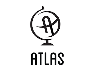
I like this logo because of the way the text is. The text looks very soft and friendly in a way and the "A" for ATLAS, is also in the image of the globe which is something that I thought was cool and a vry smart way to connect the company with the image.
I found this interesting because all the letters are lower case which is something that is not typical. The penguin also looks like a lower case A which represents the word ark.
I liked this logo because it is a perfect visual representation of the company and it is not confusing at all.


